
Hi, my name is Barbara. I'm a UX/UI Designer with a product-oriented mindset.
With 6 years in digital products and 3 specializing in UX/UI, I've helped global clients and small business navigate through digital complexity. What excites me about design is the challenge of blending creativity with clarity.


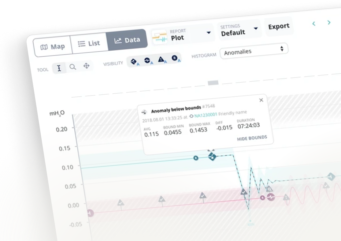
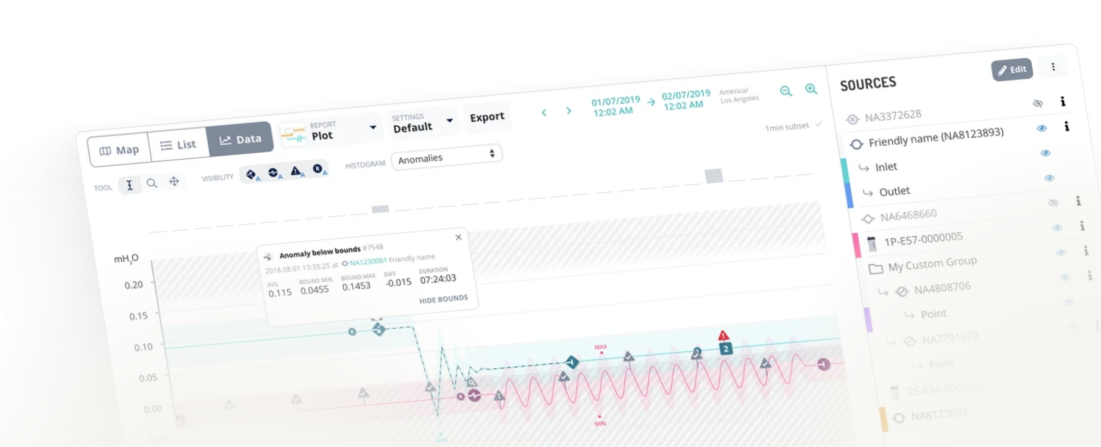
Water network analytics webapp
My role: UX/UI Designer
Focus areas: UX Design, UI Design, Design System
All designs are debranded
During my time here I have:
- maintained and updated the design system while also migrating the project from Sketch to Figma (addressing all the inconsistencies and legacy artifacts - work for an eagle eye!)
- delivered solutions aligned with an evolving roadmap
- addressed issues raised by customer service to ensure a user-centric approach
- conducted user research and interviews.
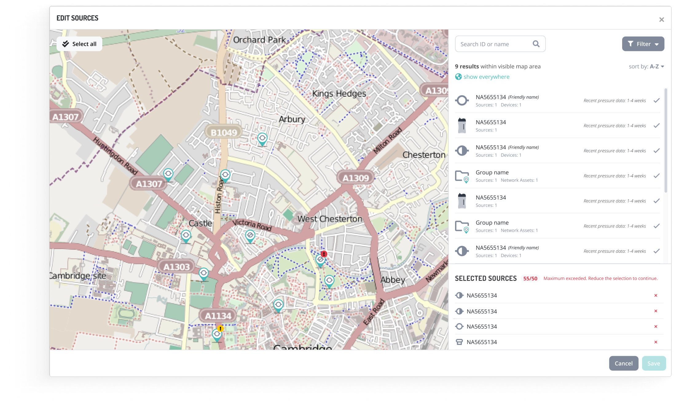
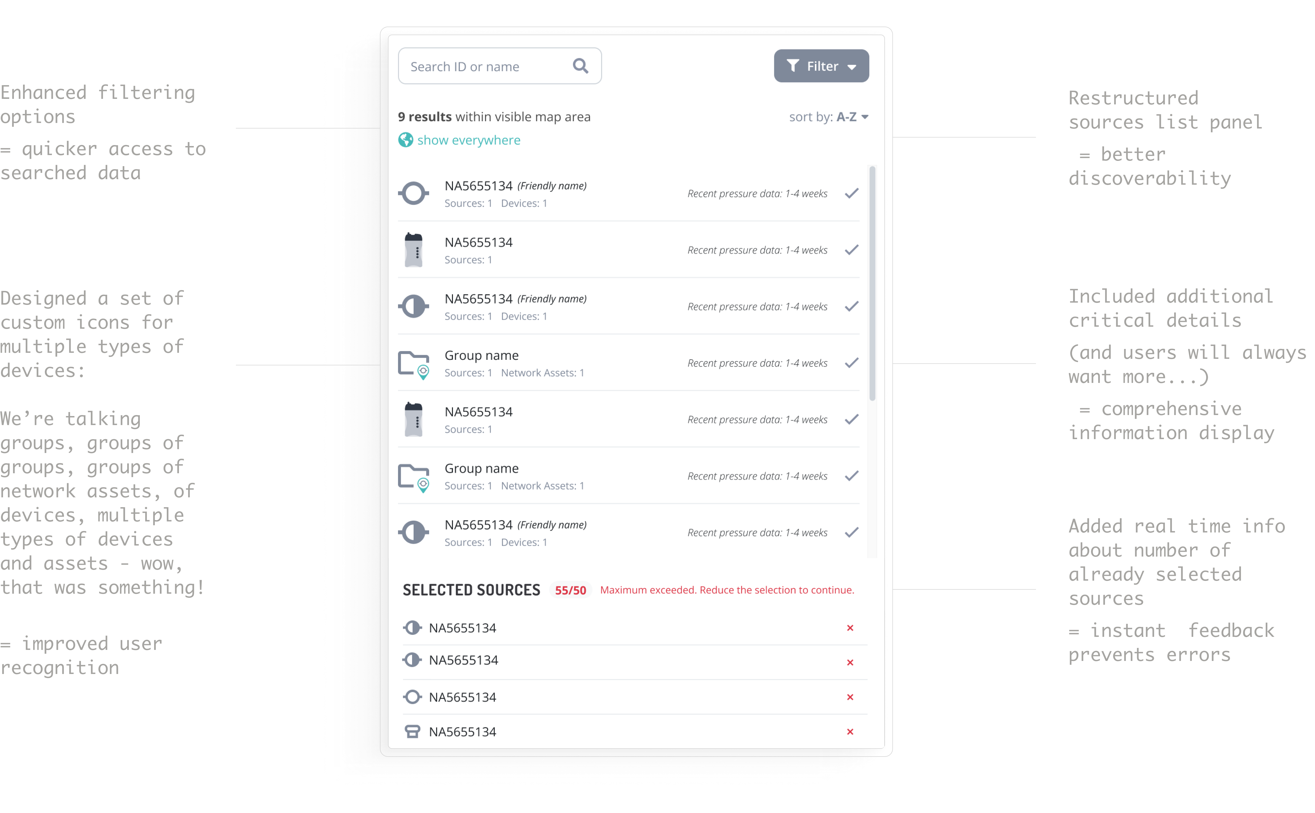
I worked on one of the most significant updates to the system since its start: how users select data sources that they want to analyze in the graph.
We started with the research (user interviews and heuristic analysis) into how users interacted with the map in their daily workflows. Observing their behaviors showed that starting with the map—rather than a list—aligned better with their needs. This is where we outlined the top-level goals:
- switch from a list-first approach to a map-first one
- improve the filtering
- ensure users could still "search everywhere" when necessary.
Note: All images reflect the final result.
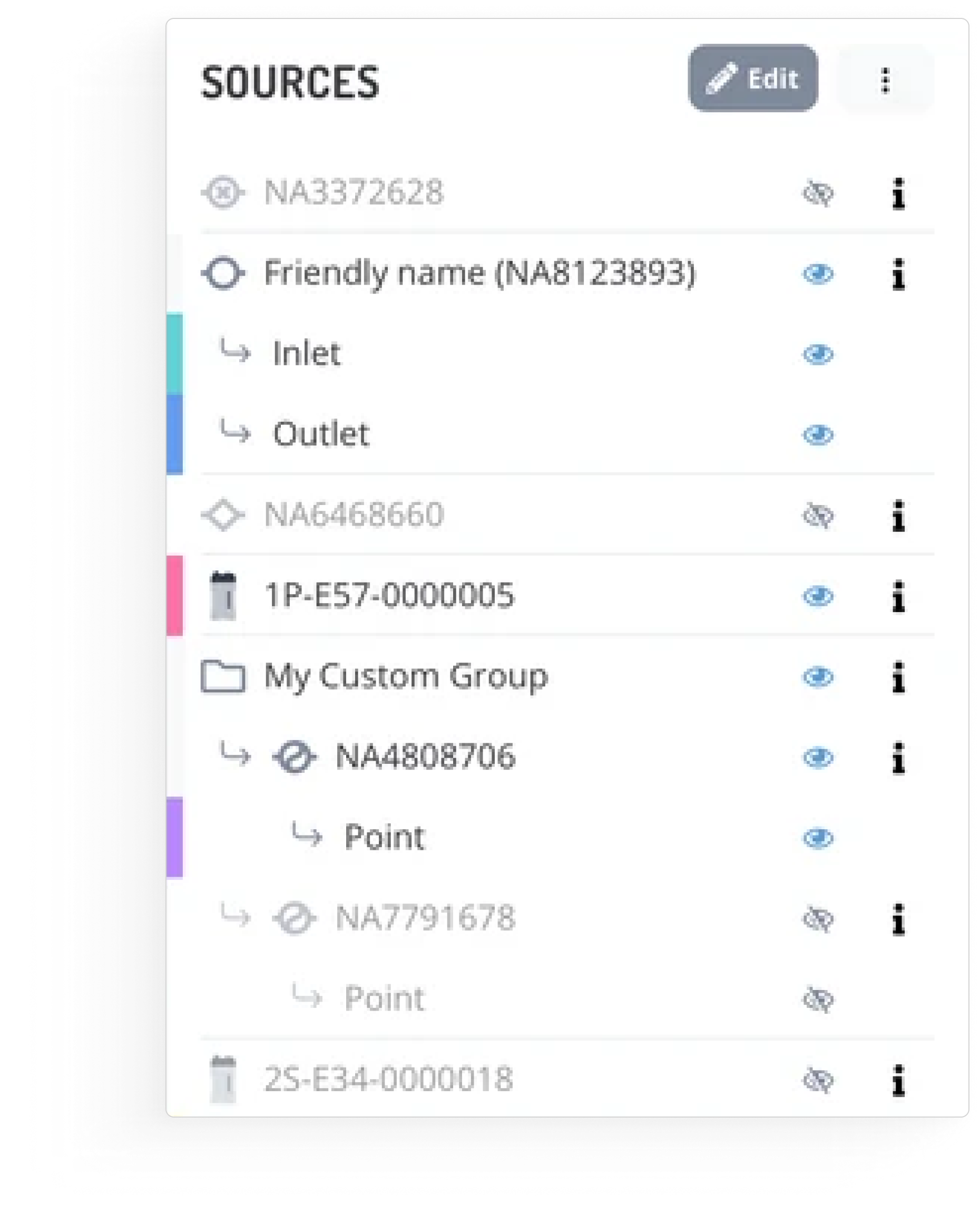
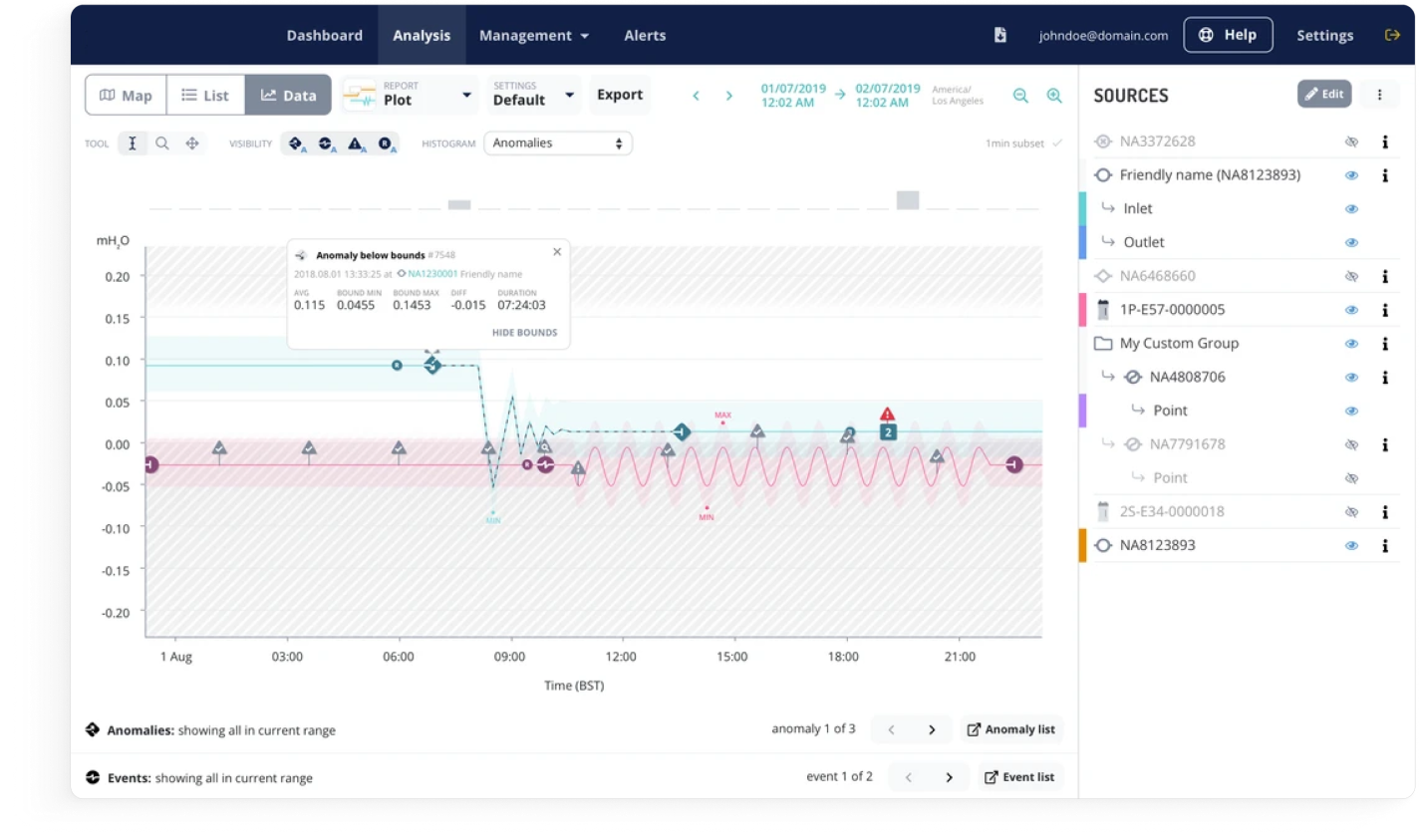
- Dynamic list that reflects only sources visible on the current map view.
- Add or remove sources directly from the map or the list.
- Global search for looking beyond the visible area.
- Full screen modal to take advantage of entire viewport.
This was one of my most rewarding projects as a designer. My work helped enhance every-day work of engineers and data analysts, who monitor and help avoid water loss, the most precious resource on earth. I’ve learned how important it is for me to work on projects that I am aligned with.
- Documentation - your future friend: Keeping the documentation clear and precise helped bridge the knowledge gap and maintain consistency when a new member joined the team.
- Adapt to thrive: Shifting roadmaps and new challenges taught me to embrace flexibility while staying focused on the bigger picture.
- Dive deep for better outcomes: A thorough understanding of this complex product and its intricacies helped me create more effective solutions.
It’s one of those projects where deep understanding of features, and naming convention was crucial, the smallest details could influence the outcome. As I entered the project as a designer, I had to go back and forth to remember all the technicalities. Next time I’ll make sure to prepare a glossary for myself (and people coming after me).